Further Research for Swimming Pool Piece for Newport Museum
For my Swimming Pool piece for Newport Museum, I will be painting an image from underwater photographs I have taken. My intention is to layer the image over 4 sheets of glass. As such, I need to do some research into painting on glass.
The intention is to paint on the reverse of the glass, so the paint is protected. This means that the image will need to be reversed and painted from foreground to background, rather than the usual background to foreground.
I found this demonstration by glass artist Richard Rowan:
Richard Rowan

There is much to take from this video - how he applies the paint and how he makes adjustments by putting the glass on a stand so that he can see the image from the 'right side'. The use of palette knife and fingers to apply the paint and the layering of colours, sometimes left to dry for crisp edges, sometimes when wet so that you can blend them.
He paints thickly using oils on one single sheet of glass, however as I am thinking of doing 4 layers of painting over 4 sheets of glass, I need to take into consideration the opacity of the paint I will be using.
I am thinking that the layers will be:
Layer 1 - background - pool tiles
Layer 2 - part of swimmer above water level & water splashes
Layer 3 - part of swimmer underwater
Layer 4 - reflections and patterns on water & bubbles
Layers 1, 2 & 4 can be opaque (level 4 will not have much on it - just a few marks), however level 3 will need to be somewhat translucent in order to be able to see the background through the water.
I am still undecided as to whether the final piece will be over 4 layers - the glass units I have are quite short and wide, so I'm not sure if they will be a suitable fit for the image. They are also very slightly tinted, so I am not sure if I will be able to achieve the effect I am aiming for. I will experiment with them, but I may create a single layer painting on a single sheet of glass I have as a back-up plan!
My husband also recorded a film for me that he'd watched late one night and thought I might be interested in. 'Kiss the Water' is a film about Megan Boyd, a world renowned Scottish craftswoman who makes fishing flies. I thought he had gone slightly mad, but when he made me watch it I understood - there was some beautiful animation by Em Cooper. She has created the images for the animation by painting in oils on glass and it includes a young boy swimming underwater with salmon - very apt for my planned piece. You can find a link to her website here:
Em Cooper

Whilst I want to create a still piece rather than animation, I do love the effect of the oil paint on glass and the fluidity of movement that can be created, so I am again leaning towards oil paint as the medium I shall use. I will experiment with mixing in some turquoise glass paint for areas that I wish to be more translucent.
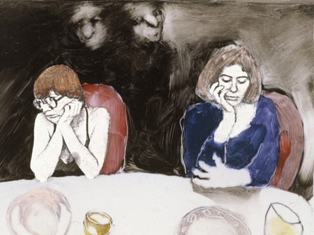
The colours she has used also give the film a 1930's feel - something else to consider. The painting I am using as inspiration is The Swimming Pool by Thomas Rathmell, and I haven't been able to find a date for when it was painted but it has a 1950's feel to it for me - the colours, the style of the swimming costumes. I could be completely wrong! But I need to bear in mind the tones of the colours I use and the effect I am looking to achieve - contemporary with the inspiration painting or the photographs I will be using.
Sian also recommended that I have a look at the work of Caroline Leaf, a Canadian Animator who works in a similar way, but with water colours mixed with glycerin.
Caroline Leaf
I understand the glycerin is in order to keep the paint fluid so that it can be moved around for animation purposes, however it is another medium I will need to experiment with. I need to find out how different paints will behave on the glass and whether they will crack or degrade over time - they will be protected by the glass, but I need to have a play to see for myself what will happen.
With Caroline's work I was particularly drawn to The Interview piece and how the background is monochrome and loose and blurred. I love how you can still see the brush strokes - something I am not comfortable with in my own work - I must see if I can loosen up and not try to blend to death!
The intention is to paint on the reverse of the glass, so the paint is protected. This means that the image will need to be reversed and painted from foreground to background, rather than the usual background to foreground.
I found this demonstration by glass artist Richard Rowan:
Richard Rowan
There is much to take from this video - how he applies the paint and how he makes adjustments by putting the glass on a stand so that he can see the image from the 'right side'. The use of palette knife and fingers to apply the paint and the layering of colours, sometimes left to dry for crisp edges, sometimes when wet so that you can blend them.
He paints thickly using oils on one single sheet of glass, however as I am thinking of doing 4 layers of painting over 4 sheets of glass, I need to take into consideration the opacity of the paint I will be using.
I am thinking that the layers will be:
Layer 1 - background - pool tiles
Layer 2 - part of swimmer above water level & water splashes
Layer 3 - part of swimmer underwater
Layer 4 - reflections and patterns on water & bubbles
Layers 1, 2 & 4 can be opaque (level 4 will not have much on it - just a few marks), however level 3 will need to be somewhat translucent in order to be able to see the background through the water.
I am still undecided as to whether the final piece will be over 4 layers - the glass units I have are quite short and wide, so I'm not sure if they will be a suitable fit for the image. They are also very slightly tinted, so I am not sure if I will be able to achieve the effect I am aiming for. I will experiment with them, but I may create a single layer painting on a single sheet of glass I have as a back-up plan!
My husband also recorded a film for me that he'd watched late one night and thought I might be interested in. 'Kiss the Water' is a film about Megan Boyd, a world renowned Scottish craftswoman who makes fishing flies. I thought he had gone slightly mad, but when he made me watch it I understood - there was some beautiful animation by Em Cooper. She has created the images for the animation by painting in oils on glass and it includes a young boy swimming underwater with salmon - very apt for my planned piece. You can find a link to her website here:
Em Cooper
Whilst I want to create a still piece rather than animation, I do love the effect of the oil paint on glass and the fluidity of movement that can be created, so I am again leaning towards oil paint as the medium I shall use. I will experiment with mixing in some turquoise glass paint for areas that I wish to be more translucent.
The colours she has used also give the film a 1930's feel - something else to consider. The painting I am using as inspiration is The Swimming Pool by Thomas Rathmell, and I haven't been able to find a date for when it was painted but it has a 1950's feel to it for me - the colours, the style of the swimming costumes. I could be completely wrong! But I need to bear in mind the tones of the colours I use and the effect I am looking to achieve - contemporary with the inspiration painting or the photographs I will be using.
Sian also recommended that I have a look at the work of Caroline Leaf, a Canadian Animator who works in a similar way, but with water colours mixed with glycerin.
Caroline Leaf
I understand the glycerin is in order to keep the paint fluid so that it can be moved around for animation purposes, however it is another medium I will need to experiment with. I need to find out how different paints will behave on the glass and whether they will crack or degrade over time - they will be protected by the glass, but I need to have a play to see for myself what will happen.
With Caroline's work I was particularly drawn to The Interview piece and how the background is monochrome and loose and blurred. I love how you can still see the brush strokes - something I am not comfortable with in my own work - I must see if I can loosen up and not try to blend to death!


Comments
Post a Comment